
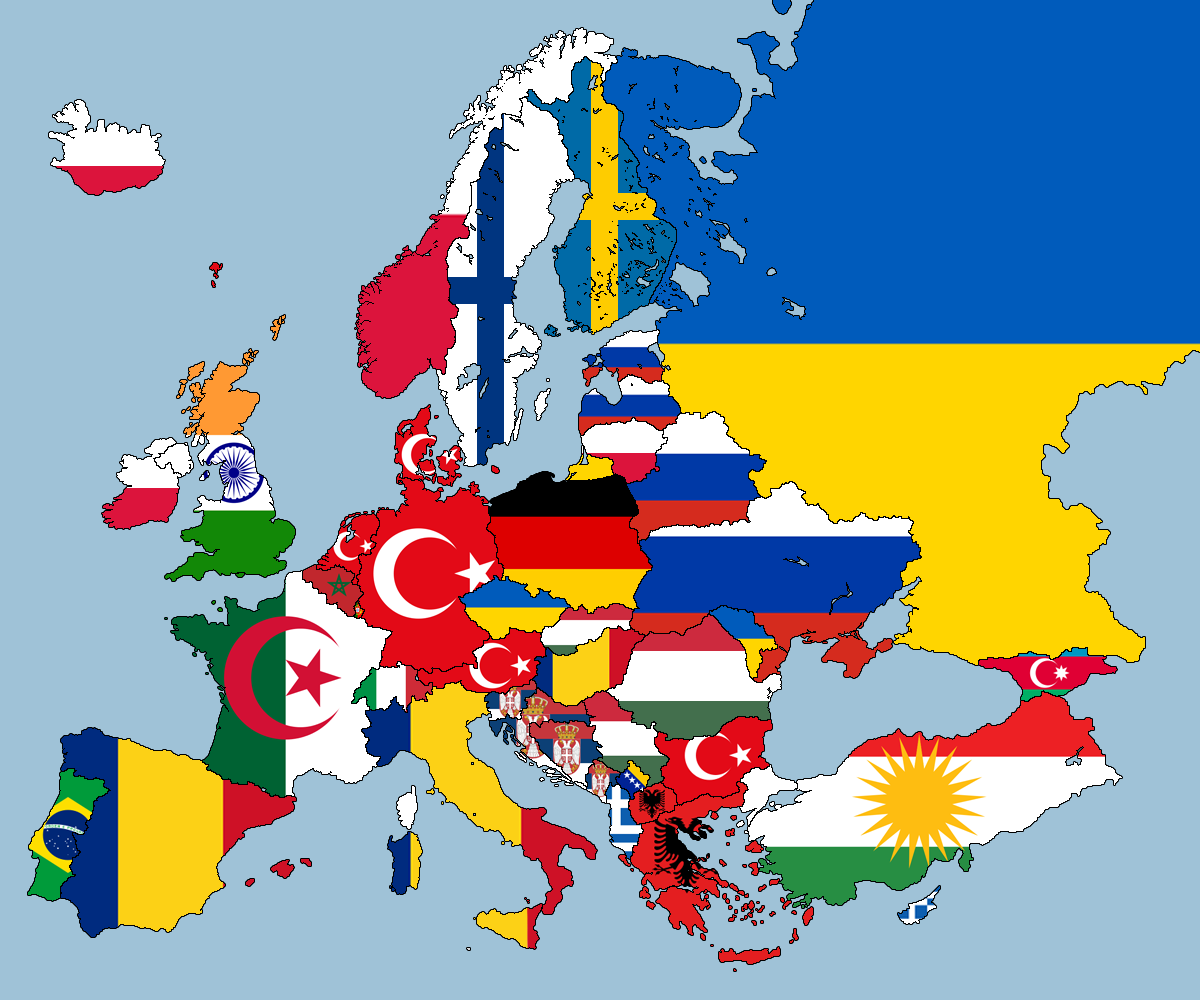
This map has had a wide circulation lately, retweeted and shared hundreds of times. It has that ‘easy to understand’ quality that makes a good map successful but, I argue, it is also misleading on a number of levels and, ultimately, part of the problem that it is trying to cast light on.
It naturalises one of the fundamental socio-political constructions of our time the equation ‘one person = one nation-state’ and reduces migration to mobility across national borders – what about IDPs or internal migrants in China (one of the largest contemporary migration)? This map – but there are plenty of others circulating around, including on migration textbooks! – is problematic on many accounts, but for sake of briefness i’ll mention just two: a) it reduces individual stories to a national flag. How would you feel if you were a Kurd persecuted by Turkish police to be reduced to a Turkish flag? or if you were a Roma who experiences state discrimination on a daily basis in Romania? Postcolonial scholars may call this epistemic violence; b) it misses completely the point about contemporary migration: one can no longer reduce migration to the Turks in Germany, the Indians in the UK, the Algerians in France etc etc; what is terribly interesting and to many extent unprecedented about migration today (arguably since the end of the Cold War) is the level of diversification it brings in terms of demographic profiles, migration histories, geopolitical ties, and languages. This map, and many like it, not only completely misses this point, but contributes to hide it. In academic literature, we often speak on ‘methodological nationalism’ to refer to studies that take the nation state as a given framework of reference for research on migration and identity, this map is a brilliant illustration of why map makers should also think outside the nation-state box!
